WOLFPACK 20TH YEARS ANNIVERSARY COLLECTION
WOLFPACK WINNING MACHINE
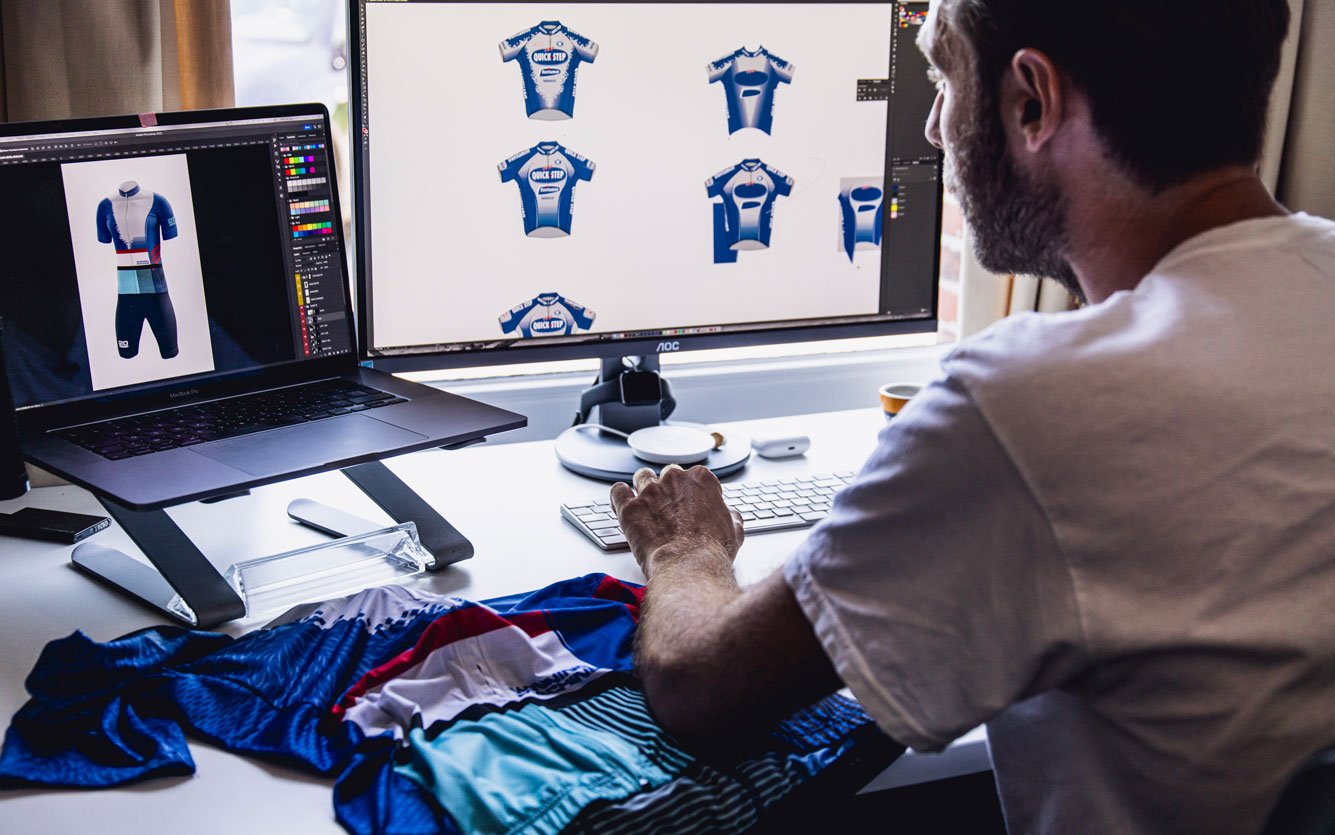
Designed by Lander Wynants, the Wolfpack Winning Machine jersey integrates all the historical jerseys of the team. Most of them have become icons in the collective memory of fans worldwide and are linked to very special moments in cycling history.
Rather than making a patchwork out of 20 jerseys, having all of them neatly organised next to each other, Lander tried to create an organic visual combining all the different shapes, colours and textures that he found in the original designs. Like the wolfpack itself he wanted the design to be homogenous and strong.
WHO IS LANDER WYNANTS?
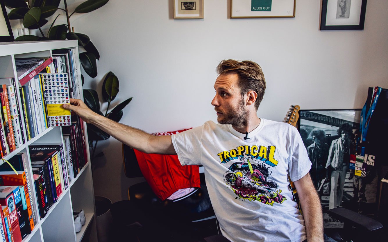
His earliest childhood memory with cycling is related to his grandfather, with whom he had a very close bond. Being raised in a bike shop as a kid in the 1940’s, he had a workshop in the garden filled to the brim with bike parts. At a very young age Lander loved working on bikes together while listening to vintage rock’n roll records.
WOLFPACK DE MUUR
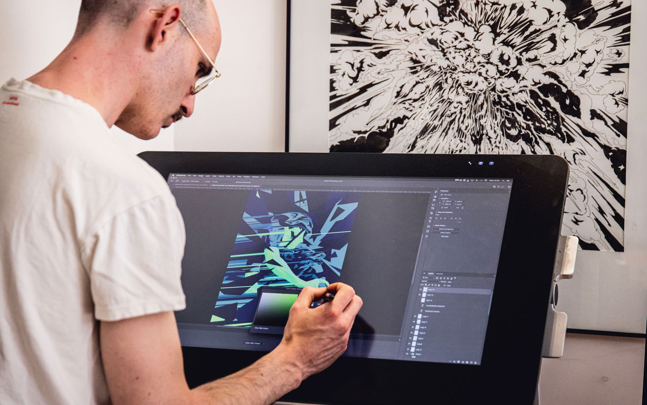
In the back you have a cyclist going really fast with a wolf in the back. These two elements get sucked up in a more abstract whole thing, some graphical hard shapes, but overall is a nice and balanced image.
In the front, you have a cyclist climbing the cobblestone hill, the wolves in the back going with him and again behind the crowd with a typical church. You can read it as an abstract explosion of colors and lines, but you can also read it, when you look more closely, as a little story.
Figurative story of a cyclist riding with the wolves and going up this cobblestone hill.
WHO IS JOOST JANSEN?
There is an urban element, cartoony element, comic element, manga element in "Joost Jansen" style.
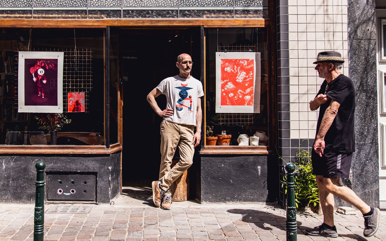
He grew up in flat Flanders where cycling was everywhere and, for this reason, was constantly present in his life. Now, he has a small studio in the heart of Brussels.
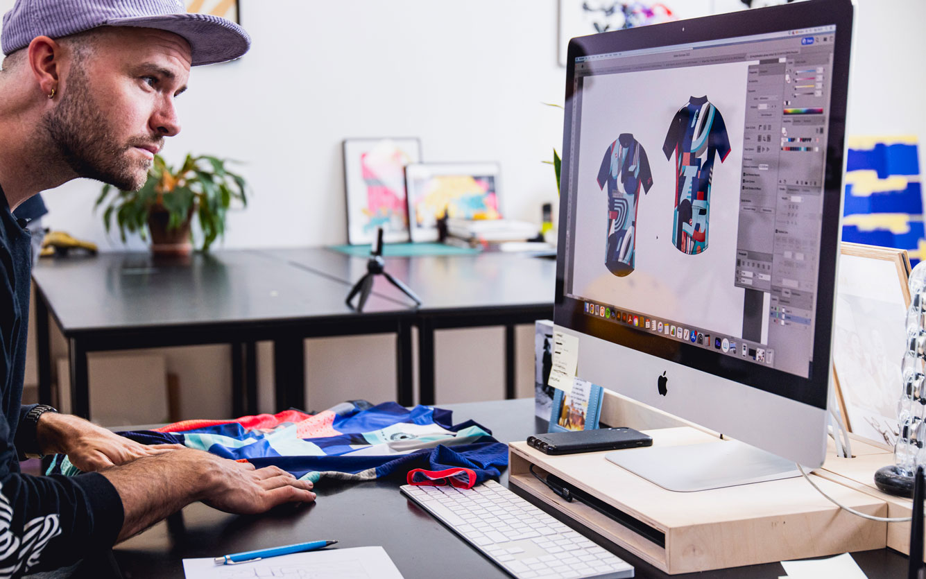
WOLVES IN HELL
On the backside, It says Hell of the north, given that The Hell of the North is the nickname of the race.
On the front it has like the quote saying: “Wolves in hell.”
The fact that it is a very hard race and there are a lot of cobble roads in it was integrated into the jersey as well with when it rains, it’s also a lot of dust in it. So it has a little bit more of this dirty kind of textures in it.
There is also a small hint to some of the injuries that a lot of the riders get when they fall down and it’s like the link to blood. It has a bit of a gothic feel to it, but it gives it more texture to the design.
The letter O which you can see is the famous track where the race ends, and you have like the lines in it.
WHO IS ELTIPO?
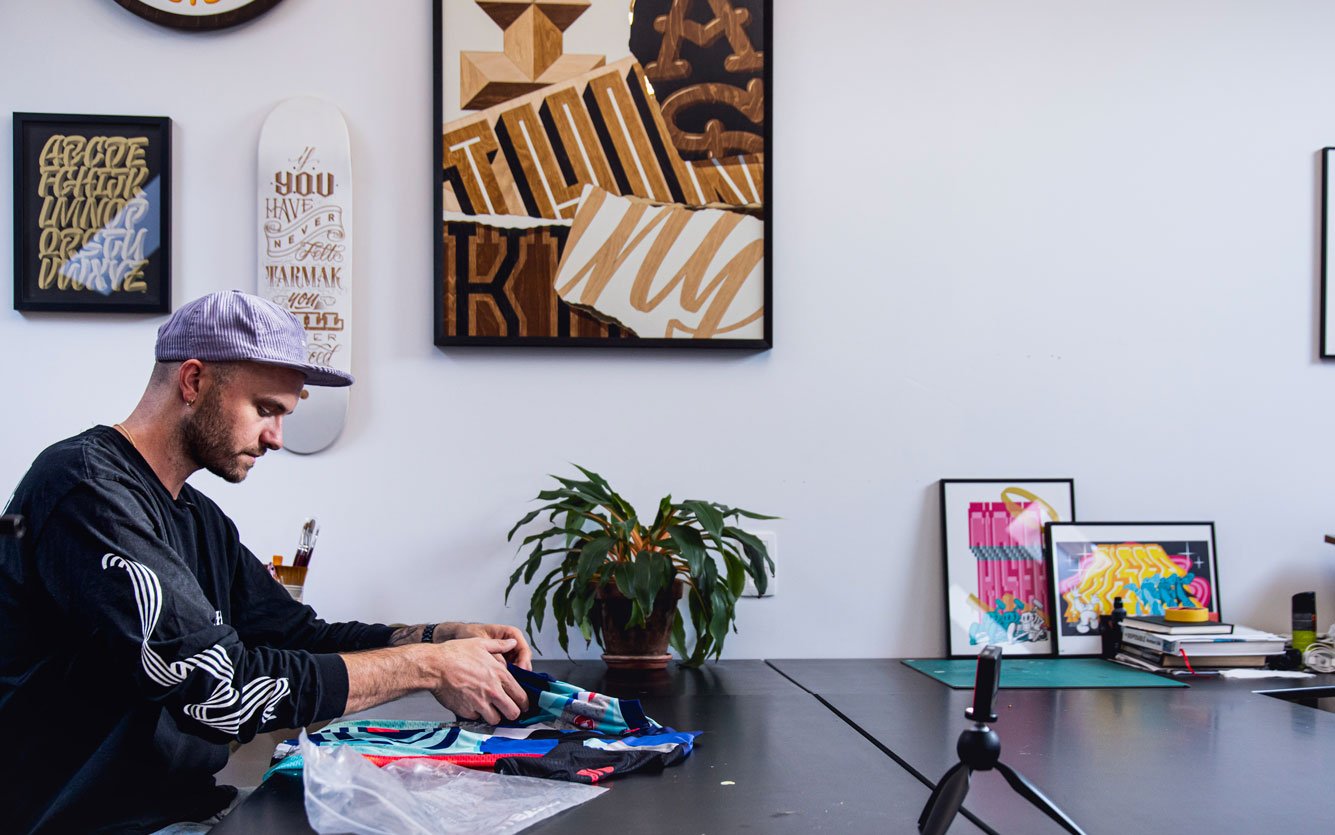
He is a graphic artist living in Antwerp. His work is a merger from typography with different kind of techniques and materials combined together to create a unique style.
He used to ride BMX when he was a kid with a couple of friends, and building dirt jumps and just having fun. And then he took it as a professional sport. So he went racing.
He grew up in a car body shop of his father. And there he started experimenting with paint as he was always super fascinated by the look of jerseys and the gear of the riders and he started painting helmets and the graphics applying on bikes and on motorcycles.
GIRO
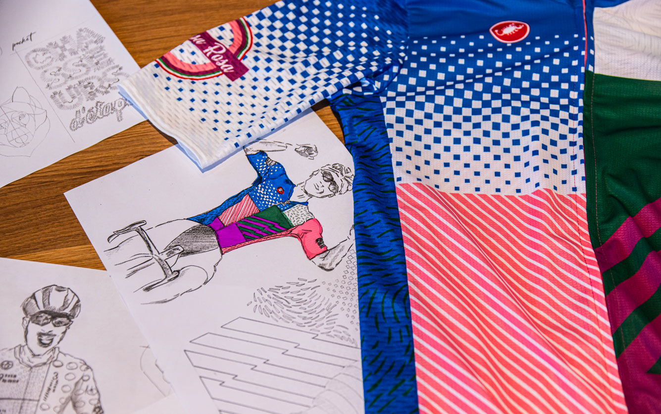
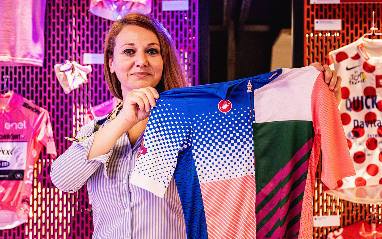
The blue also represents the identity of the team and was integrated using the stitch pattern of the first Quick-Step jersey of 2003.
Another identifying element of this jersey is the zipper, that represents the Senza Fine trophy of the Giro d’Italia which features also on the official pink jersey.
WHO IS LUISA MENINI?
Here at Castelli she has found various incentives. Cycling has always fascinated her, ever since she was a child, she also practiced it a bit. And the over time, when the opportunity came to actively work within it, she took it immediately. It really gives her a lot of satisfaction to do this.